Nir G


Create Design System
Complete transformation of a complex accounting system
B2B
Figma training
Complex system
Design system
Summary
Background
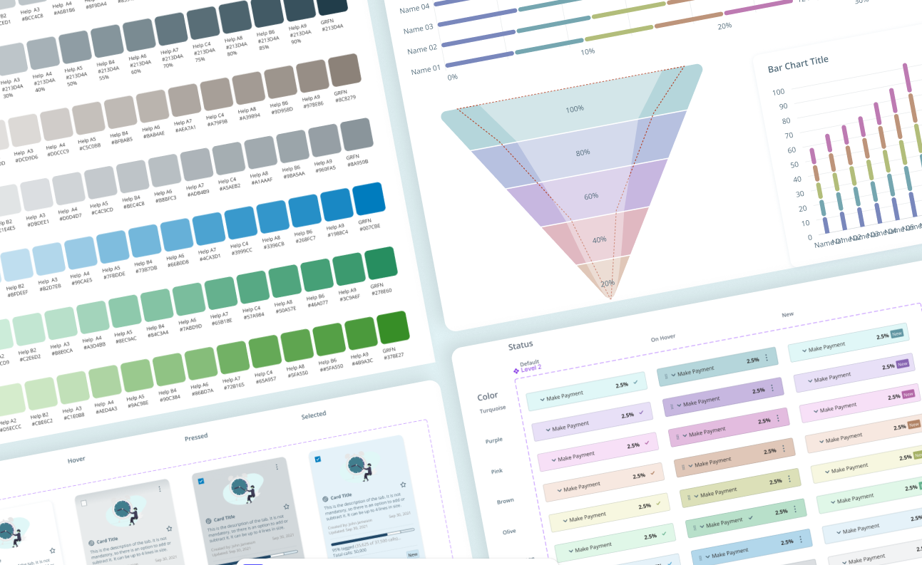
The project began with NICE's strategic transition from Adobe XD to the Figma platform. I was required to lead a rebuild of the Design System from scratch, which included cleaning up design debt from old templates and defining a new hierarchy and work architecture that would align with Figma's methodology and ensure design continuity.
Main challenge
Re-Architecture: A complete rebuild of the complex Design System in Figma (from scratch), requiring Legacy Cleanup of old templates and the creation of a new hierarchy and modular component architecture (Atomic Design, Variables) to meet future product and development needs.
Change Management: Successfully migrating the entire Design Team to the new software through customized training, group, and individual mentorship, ensuring full adoption of the new tool and methodology.
CLIENT
Nice
SERVICES
- Design System
- Figma training
- UX/UI
Impact
The modular Figma Design System (utilizing Variables) established unprecedented design consistency and ease of work across all products. This dramatically improved team efficiency and component architecture was quickly adopted by other systems in the company.
80%
Faster Design Delivery
By using components and autolayout
100%
Design Consistency
Via implementing Figma Variables, Tokens & Components.
2
Teams Adopted the Standard
Became architectural standard for 2 additional product teams.

Getting Started
Research & Definition
The project began with a comprehensive assessment phase to define the scope of the Figma migration. This phase included:
XD Review: Analyzing the legacy Design System to identify design debt and outdated templates.
Team Readiness: My team of 10 designers had zero prior Figma knowledge. I ran a daily course tailored to each person's pace, setting challenges and goals as they leveled up to a professional standard, followed by monthly updates on new tools and techniques.
Gap Analysis: Defining new functional requirements and critical gaps in collaboration with stakeholders.
USER
The User
Ultimately uses the component in the product. The most important person the component has to serve — it should make their experience wonderful and their usage effortless.
DESIGNER
The Designer
Current or future team member. Needs to know when and how to use the component, the correct way to implement it, and its limitations.
DEVELOPER
The Developer
Builds the component to match the design system today, and later needs to recognize and implement it correctly whenever it appears in a new design.

Exempels
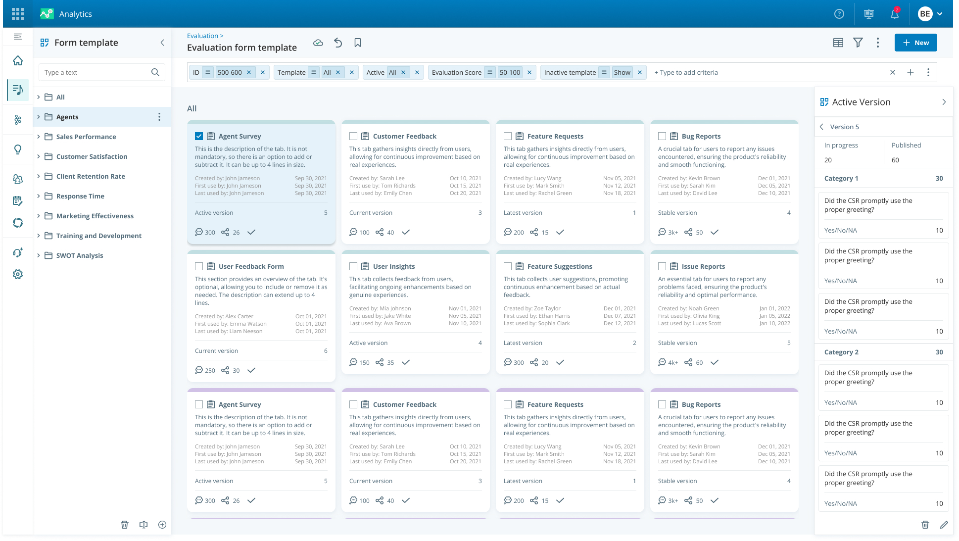
Card Component
The Process
- Discovery: I brought the full 10-person design team into the process to understand where this solution was needed now or in the future, and what its requirements were.
- Mapping & Architectural Design: I mapped the requirements and built a single, scalable central "tab" component in Figma, flexible enough to cover every use case.
- Validation, Handoff & Training: I checked in with the team at every stage, handed the component to development in an organized way, and ran a training session so the team knew how to use it.
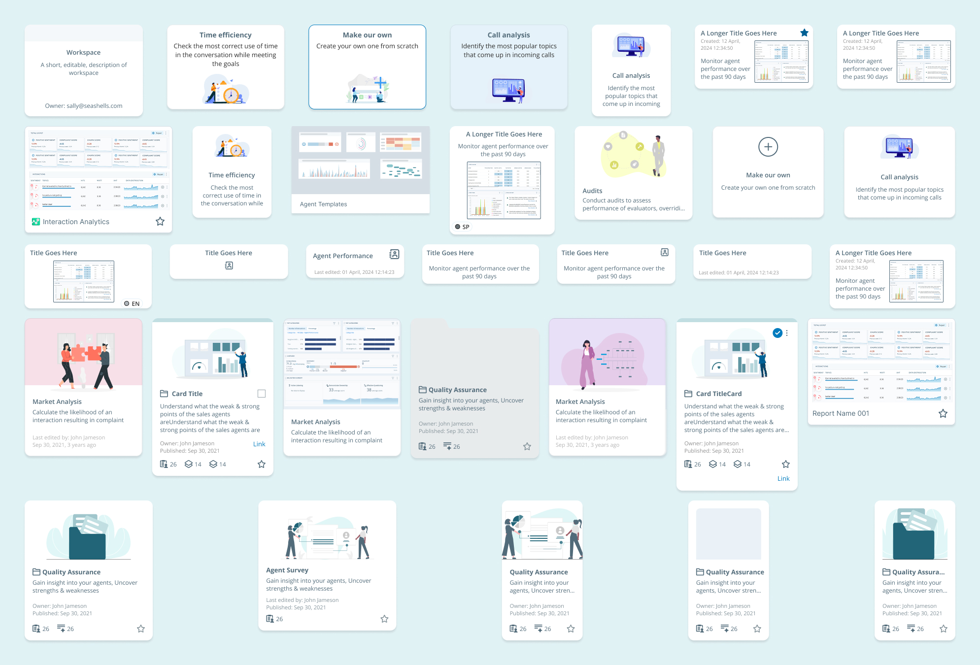
Card component Before
The Resoults
- A single, complex component: a holistic response to all product requirements, easy to operate by designers (Easy-to-Use Properties in Figma).
- Uniform visibility and improved experience: Creating visual consistency throughout the system, dramatically improving the user experience and reducing cognitive load.
- Reduced design debt: Significantly easing maintenance and making future changes.
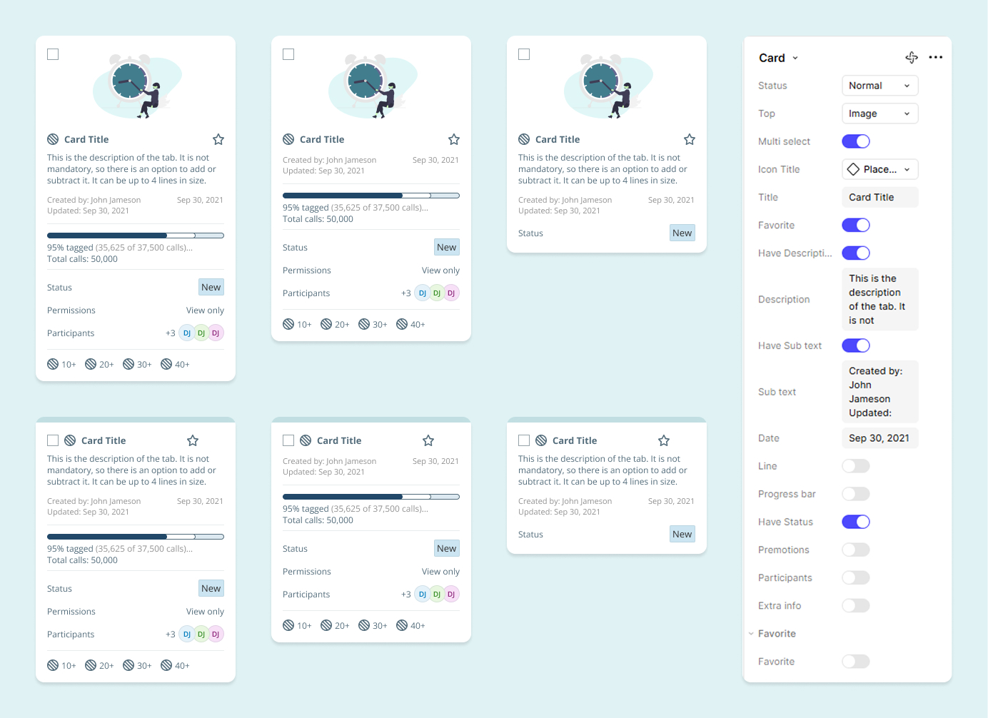
Card component After
Bar Chart Component
The technical challenge: I inherited a Bar Graph component that already existed in multiple places across the site, each in a different configuration with different requirements — with no characterization document or usage guidelines anywhere.
My process: after a session with the team lead and a full review of the site, I mapped every existing state and requirement. Conversations with product managers clarified what the component was actually meant to represent and how users engaged with it. I decided to keep the same visual language but adapt it to the system's existing style, rather than reinvent it.
The hardest test was resizing: since the component appears at many places and sizes, its internal elements had to behave in a fully scalable way. I didn't compromise on flexibility to get there, but ran kickoff conversations with the team about the component's capabilities and limits before releasing it.
The result: a component so solid that a larger group of designers in the company immediately asked for the entire chart-component set, adapted to their own design language. I now run workshops teaching other designers how to build complex components like this one.
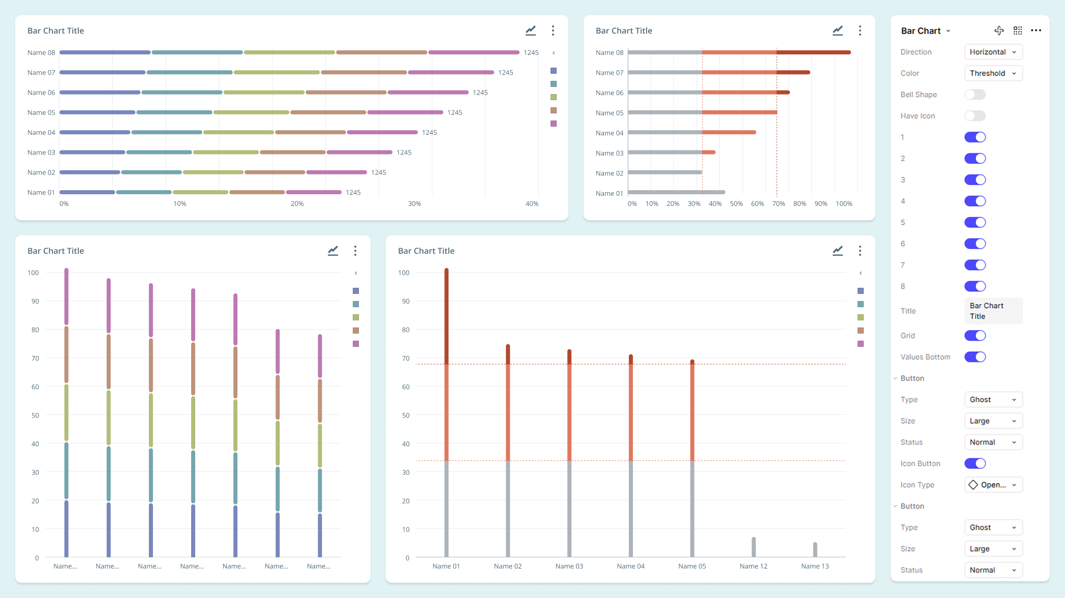
Bar Chart Component
Effect
Rebuilding from scratch instead of patching the old system was my call, based on years of watching where the cracks kept forming. It created a new, advanced, and unified architectural foundation in Figma, which led to a dramatic improvement in product consistency and productivity capabilities of the design teams at NICE.
Ready to create
great things
Got a complex challenge? Let's solve it together.
Let's talk

Download Resume




Create Design System
Complete transformation of a complex accounting system
B2B
Figma training
Complex system
Design system
Summary
Background
The project began with NICE's strategic transition from Adobe XD to the Figma platform. I was required to lead a rebuild of the Design System from scratch, which included cleaning up design debt from old templates and defining a new hierarchy and work architecture that would align with Figma's methodology and ensure design continuity.
Main challenge
Re-Architecture: A complete rebuild of the complex Design System in Figma (from scratch), requiring Legacy Cleanup of old templates and the creation of a new hierarchy and modular component architecture (Atomic Design, Variables) to meet future product and development needs.
Change Management: Successfully migrating the entire Design Team to the new software through customized training, group, and individual mentorship, ensuring full adoption of the new tool and methodology.
CLIENT
Nice
SERVICES
- Design System
- Figma training
- UX/UI
Impact
The modular Figma Design System (utilizing Variables) established unprecedented design consistency and ease of work across all products. This dramatically improved team efficiency and component architecture was quickly adopted by other systems in the company.
80%
Faster Design Delivery
By using components and autolayout
100%
Design Consistency
Via implementing Figma Variables, Tokens & Components.
2
Teams Adopted the Standard
Became architectural standard for 2 additional product teams.
Getting Started
Research & Definition
The project began with a comprehensive assessment phase to define the scope of the Figma migration. This phase included:
XD Review: Analyzing the legacy Design System to identify design debt and outdated templates.
Team Readiness: My team of 10 designers had zero prior Figma knowledge. I ran a daily course tailored to each person's pace, setting challenges and goals as they leveled up to a professional standard, followed by monthly updates on new tools and techniques.
Gap Analysis: Defining new functional requirements and critical gaps in collaboration with stakeholders.
USER
The User
Ultimately uses the component in the product. The most important person the component has to serve — it should make their experience wonderful and their usage effortless.
DESIGNER
The Designer
Current or future team member. Needs to know when and how to use the component, the correct way to implement it, and its limitations.
DEVELOPER
The Developer
Builds the component to match the design system today, and later needs to recognize and implement it correctly whenever it appears in a new design.
Exempels
Card Component
The Process
- Discovery: I brought the full 10-person design team into the process to understand where this solution was needed now or in the future, and what its requirements were.
- Mapping & Architectural Design: I mapped the requirements and built a single, scalable central "tab" component in Figma, flexible enough to cover every use case.
- Validation, Handoff & Training: I checked in with the team at every stage, handed the component to development in an organized way, and ran a training session so the team knew how to use it.
Card component Before
The Resoults
- A single, complex component: a holistic response to all product requirements, easy to operate by designers (Easy-to-Use Properties in Figma).
- Uniform visibility and improved experience: Creating visual consistency throughout the system, dramatically improving the user experience and reducing cognitive load.
- Reduced design debt: Significantly easing maintenance and making future changes.
Card component After
Bar Chart Component
The technical challenge: I inherited a Bar Graph component that already existed in multiple places across the site, each in a different configuration with different requirements — with no characterization document or usage guidelines anywhere.
My process: after a session with the team lead and a full review of the site, I mapped every existing state and requirement. Conversations with product managers clarified what the component was actually meant to represent and how users engaged with it. I decided to keep the same visual language but adapt it to the system's existing style, rather than reinvent it.
The hardest test was resizing: since the component appears at many places and sizes, its internal elements had to behave in a fully scalable way. I didn't compromise on flexibility to get there, but ran kickoff conversations with the team about the component's capabilities and limits before releasing it.
The result: a component so solid that a larger group of designers in the company immediately asked for the entire chart-component set, adapted to their own design language. I now run workshops teaching other designers how to build complex components like this one.
Bar Chart Component
Effect
Rebuilding from scratch instead of patching the old system was my call, based on years of watching where the cracks kept forming. It created a new, advanced, and unified architectural foundation in Figma, which led to a dramatic improvement in product consistency and productivity capabilities of the design teams at NICE.
Ready to create
great things
Got a complex challenge? Let's solve it together.
Let's talk
Download Resume

Create Design System
Complete transformation of a complex accounting system
B2B
Figma training
Complex system
Design system
Summary
Background
The project began with NICE's strategic transition from Adobe XD to the Figma platform. I was required to lead a rebuild of the Design System from scratch, which included cleaning up design debt from old templates and defining a new hierarchy and work architecture that would align with Figma's methodology and ensure design continuity.
Main challenge
Re-Architecture: A complete rebuild of the complex Design System in Figma (from scratch), requiring Legacy Cleanup of old templates and the creation of a new hierarchy and modular component architecture (Atomic Design, Variables) to meet future product and development needs.
Change Management: Successfully migrating the entire Design Team to the new software through customized training, group, and individual mentorship, ensuring full adoption of the new tool and methodology.
CLIENT
Nice
SERVICES
- Design System
- Figma training
- UX/UI
Impact
The modular Figma Design System (utilizing Variables) established unprecedented design consistency and ease of work across all products. This dramatically improved team efficiency and component architecture was quickly adopted by other systems in the company.
80%
Faster Design Delivery
By using components and autolayout
100%
Design Consistency
Via implementing Figma Variables, Tokens & Components.
2
Teams Adopted the Standard
Became architectural standard for 2 additional product teams.
Getting Started
Research & Definition
The project began with a comprehensive assessment phase to define the scope of the Figma migration. This phase included:
XD Review: Analyzing the legacy Design System to identify design debt and outdated templates.
Team Readiness: My team of 10 designers had zero prior Figma knowledge. I ran a daily course tailored to each person's pace, setting challenges and goals as they leveled up to a professional standard, followed by monthly updates on new tools and techniques.
Gap Analysis: Defining new functional requirements and critical gaps in collaboration with stakeholders.
USER
The User
Ultimately uses the component in the product. The most important person the component has to serve — it should make their experience wonderful and their usage effortless.
DESIGNER
The Designer
Current or future team member. Needs to know when and how to use the component, the correct way to implement it, and its limitations.
DEVELOPER
The Developer
Builds the component to match the design system today, and later needs to recognize and implement it correctly whenever it appears in a new design.
Examples
Card Component
The Process
- Discovery: I brought the full 10-person design team into the process to understand where this solution was needed now or in the future, and what its requirements were.
- Mapping & Architectural Design: I mapped the requirements and built a single, scalable central "tab" component in Figma, flexible enough to cover every use case.
- Validation, Handoff & Training: I checked in with the team at every stage, handed the component to development in an organized way, and ran a training session so the team knew how to use it.
Card component Before
The Results
- A single, complex component: a holistic response to all product requirements, easy to operate by designers (Easy-to-Use Properties in Figma).
- Uniform visibility and improved experience: Creating visual consistency throughout the system, dramatically improving the user experience and reducing cognitive load.
- Reduced design debt: Significantly easing maintenance and making future changes.
Card component After
Bar Chart Component
The technical challenge: I inherited a Bar Graph component that already existed in multiple places across the site, each in a different configuration with different requirements — with no characterization document or usage guidelines anywhere.
My process: after a session with the team lead and a full review of the site, I mapped every existing state and requirement. Conversations with product managers clarified what the component was actually meant to represent and how users engaged with it. I decided to keep the same visual language but adapt it to the system's existing style, rather than reinvent it.
The hardest test was resizing: since the component appears at many places and sizes, its internal elements had to behave in a fully scalable way. I didn't compromise on flexibility to get there, but ran kickoff conversations with the team about the component's capabilities and limits before releasing it.
The result: a component so solid that a larger group of designers in the company immediately asked for the entire chart-component set, adapted to their own design language. I now run workshops teaching other designers how to build complex components like this one.
Bar Chart Component
Effect
Rebuilding from scratch instead of patching the old system was my call, based on years of watching where the cracks kept forming. It created a new, advanced, and unified architectural foundation in Figma, which led to a dramatic improvement in product consistency and productivity capabilities of the design teams at NICE.
Ready to create
great things
Got a complex challenge? Let's solve it together.
Let's talk
Download Resume