Nir G


Mobile accounting app
Complete transformation of a complex accounting system
Mobile
Native
Complex system
Design system
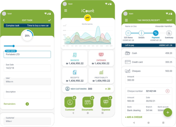
Summary
Background
ICount provides comprehensive accounting and business management solutions through an advanced web system and applications, serving a wide range of clients (from small businesses to large corporations). When I joined, the existing system lacked professional characterization and design.
Main challenge
To lead a Zero-to-One process of characterization and redesign of all complex systems – the web and applications – while maintaining a high development pace and ensuring a smooth transition experience for existing customers, and coping with rapid business growth.
CLIENT
iCount
SERVICES
- UX/UI
- Webflow development
- Branding
Impact
Platform Expansion & Seamless Transition: My decision to roll out the fixes gradually, not all at once, is what protected the business here. I developed and designed 3 native applications (iOS/Android), providing a consistent, lean mobile experience and a smooth, optimal customer transition to the redesigned versions.
100%+
New Users
The project led to dramatic business growth over 3 years
3
New Apps
Driving Competitive Advantage: The project led to dramatic business growth.
Smoother Flows, Lower Complaints
UX enhancements created smoother product flows, resulting in a significant reduction in service complaints and inquiries.
Getting Started
Research & Definition
- Leading Cross-Functional Discovery: I led a comprehensive Discovery process for all complex systems (Web & Mobile) to ensure full strategic synchronization between platforms starting at the definition phase.
- Data and Customer-Driven Approach: Rather than direct customer interviews, I worked through open support tickets with 5 members of the service team to surface real, existing problems. This revealed critical findings: the app wasn't built natively for Android or iOS, no UX work had ever been done on it, the workflow was difficult with many unnecessary clicks, and incorrect UX was causing critical errors. Based on this, I mapped every issue, categorized them as Must / Need / Nice-to-have, and rolled out fixes gradually — instead of one big change — to avoid friction for existing users while repositioning the app as a leading part of the company's product line.
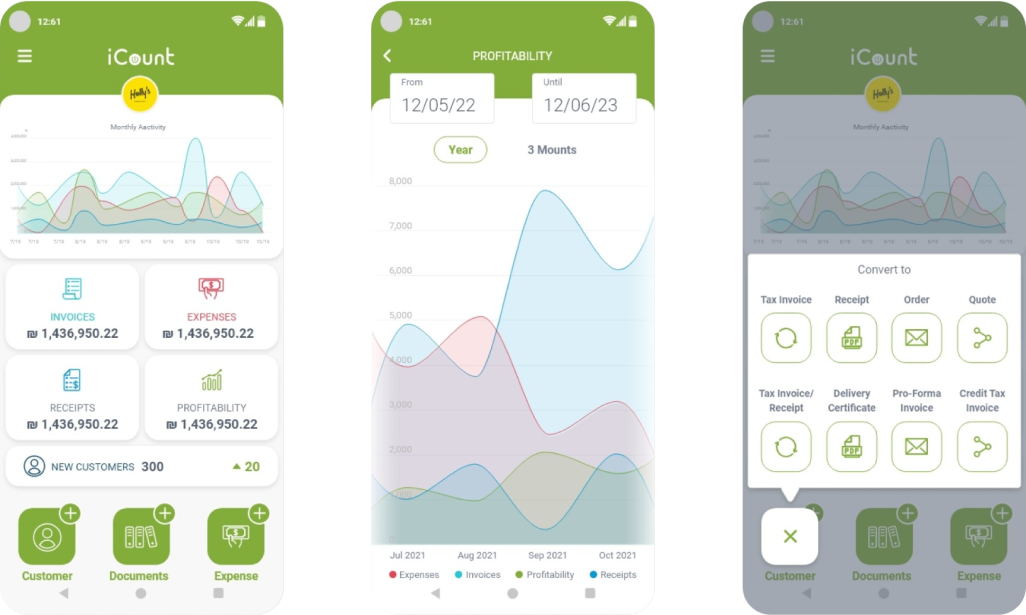
Dashboard

UX & Architecture
Website Visuals
- Full Core Process Renovation: I conducted a comprehensive re-characterization and overhaul of all core processes within the system, which included fixing critical errors in existing procedures.
- Building Information Architecture: I created accurate and new Information Architectures (IA) that strategically integrated new capabilities into the workflow
- Product Accessibility for Diverse Audiences: I designed especially simple and user-friendly procedures to ease the workload and make the system accessible to a wide range of customers (from small businesses to large companies).
Exempels
How I Simplified Complex Documents
When I arrived, creating the system's core document was a frustrating, error-ridden task. It was a complicated process that often led many customers to simply fail.
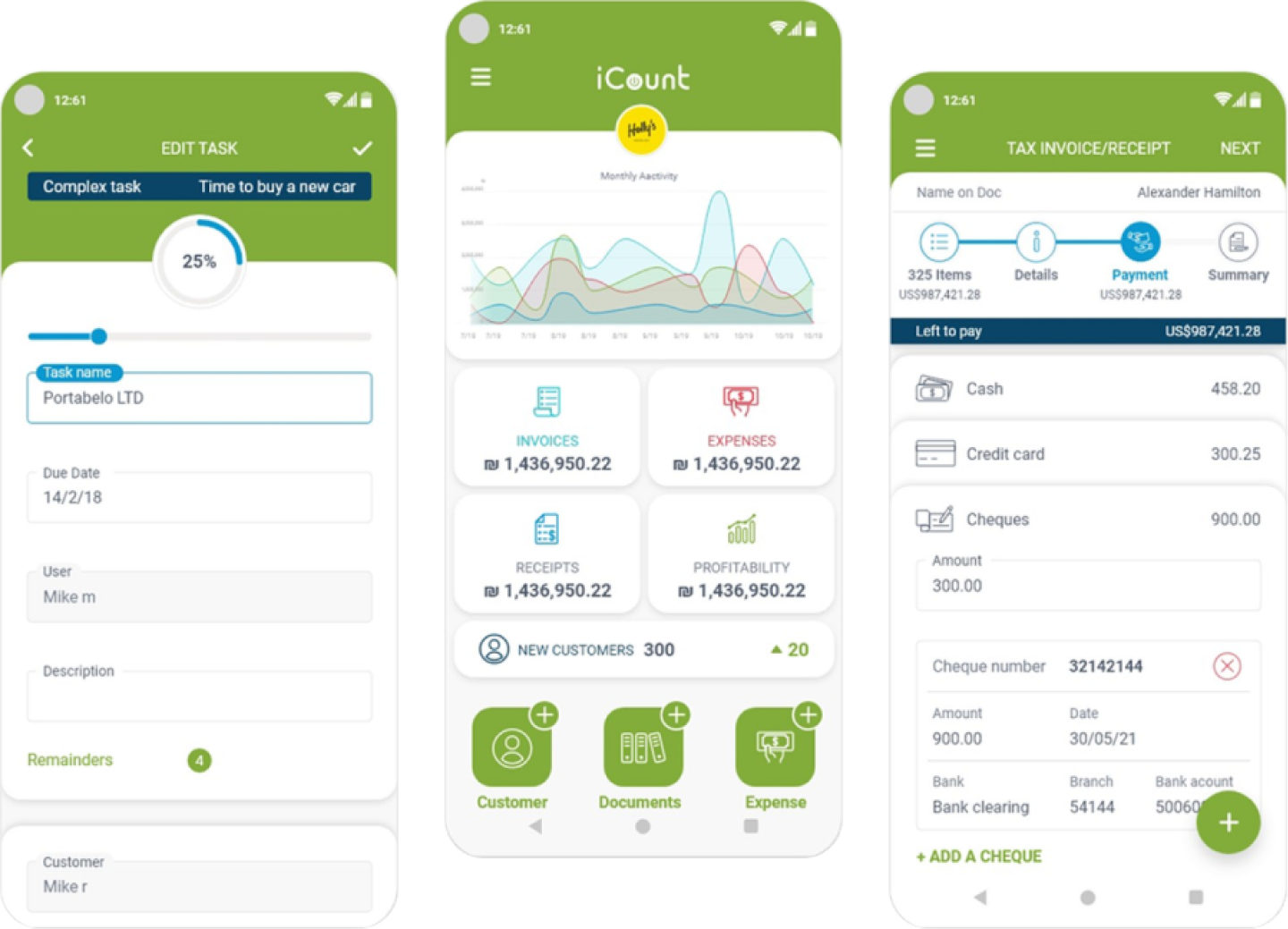
I decided to dismantle the problem: I took all the complexity and created a smart 4-step Wizard. Instead of confusing users, I guided them to focus on just one action per step.
To reassure customers, I made sure they could always see their status (progress bar) and the final total amount. The 'magic' was that all the advanced capabilities were retained, but I successfully fixed all the critical errors that had sabotaged the process.
The Result: A procedure that was once a hurdle became a seamless flow, and the failure rate dropped significantly.
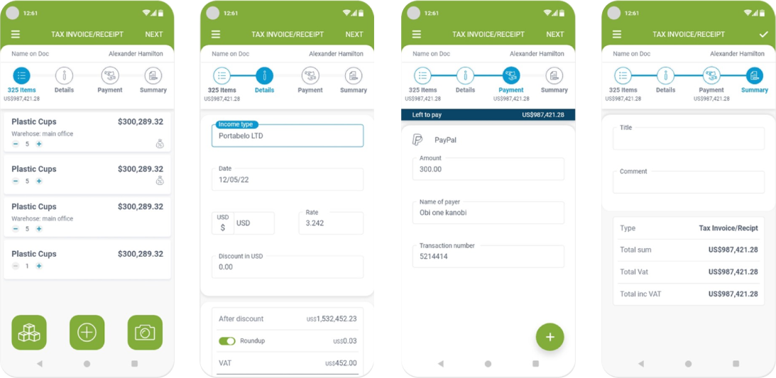
Document 4 step wizard
Rebuilding Task Management from the Ground Up
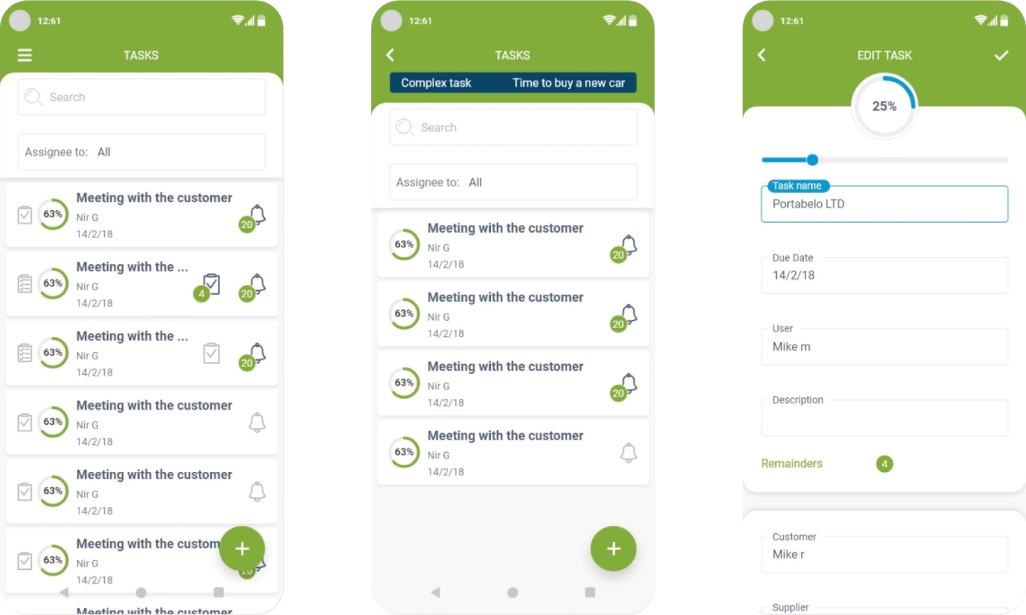
Before this fix, the product simply wasn't usable: too many steps and no clear connection between sub-tasks, parent tasks, and reminders created deep confusion, and there was no way to glance at the list and understand where any task actually stood. I ran research with users who surfaced exactly these problems, then made the call to map the real hierarchy: a parent task with its own reminders, containing multiple sub-tasks — each with its own reminders and a completion percentage that rolls up into the parent task's status. Fast navigation now works in both directions, from the overview into any sub-task and back out again.
Case Study Template Page

Ready to create
great things
Got a complex challenge? Let's solve it together.
Let's talk

Download Resume




Mobile accounting app
Complete transformation of a complex accounting system
Mobile
Native
Complex system
Design system
Summary
Background
ICount provides comprehensive accounting and business management solutions through an advanced web system and applications, serving a wide range of clients (from small businesses to large corporations). When I joined, the existing system lacked professional characterization and design.
Main challenge
To lead a Zero-to-One process of characterization and redesign of all complex systems – the web and applications – while maintaining a high development pace and ensuring a smooth transition experience for existing customers, and coping with rapid business growth.
CLIENT
iCount
SERVICES
- UX/UI
- Webflow development
- Branding
Impact
Platform Expansion & Seamless Transition: My decision to roll out the fixes gradually, not all at once, is what protected the business here. I developed and designed 3 native applications (iOS/Android), providing a consistent, lean mobile experience and a smooth, optimal customer transition to the redesigned versions.
100%+
New Users
The project led to dramatic business growth over 3 years
3
New Apps
Driving Competitive Advantage: The project led to dramatic business growth.
Smoother Flows, Lower Complaints
UX enhancements created smoother product flows, resulting in a significant reduction in service complaints and inquiries.
Getting Started
Research & Definition
- Leading Cross-Functional Discovery: I led a comprehensive Discovery process for all complex systems (Web & Mobile) to ensure full strategic synchronization between platforms starting at the definition phase.
- Data and Customer-Driven Approach: Rather than direct customer interviews, I worked through open support tickets with 5 members of the service team to surface real, existing problems. This revealed critical findings: the app wasn't built natively for Android or iOS, no UX work had ever been done on it, the workflow was difficult with many unnecessary clicks, and incorrect UX was causing critical errors. Based on this, I mapped every issue, categorized them as Must / Need / Nice-to-have, and rolled out fixes gradually — instead of one big change — to avoid friction for existing users while repositioning the app as a leading part of the company's product line.
Dashboard
UX & Architecture
Website Visuals
- Full Core Process Renovation: I conducted a comprehensive re-characterization and overhaul of all core processes within the system, which included fixing critical errors in existing procedures.
- Building Information Architecture: I created accurate and new Information Architectures (IA) that strategically integrated new capabilities into the workflow
- Product Accessibility for Diverse Audiences: I designed especially simple and user-friendly procedures to ease the workload and make the system accessible to a wide range of customers (from small businesses to large companies).
Exempels
How I Simplified Complex Documents
When I arrived, creating the system's core document was a frustrating, error-ridden task. It was a complicated process that often led many customers to simply fail.
I decided to dismantle the problem: I took all the complexity and created a smart 4-step Wizard. Instead of confusing users, I guided them to focus on just one action per step.
To reassure customers, I made sure they could always see their status (progress bar) and the final total amount. The 'magic' was that all the advanced capabilities were retained, but I successfully fixed all the critical errors that had sabotaged the process.
The Result: A procedure that was once a hurdle became a seamless flow, and the failure rate dropped significantly.
Document 4 step wizard
Rebuilding Task Management from the Ground Up
Before this fix, the product simply wasn't usable: too many steps and no clear connection between sub-tasks, parent tasks, and reminders created deep confusion, and there was no way to glance at the list and understand where any task actually stood. I ran research with users who surfaced exactly these problems, then made the call to map the real hierarchy: a parent task with its own reminders, containing multiple sub-tasks — each with its own reminders and a completion percentage that rolls up into the parent task's status. Fast navigation now works in both directions, from the overview into any sub-task and back out again.
Case Study Template Page
Ready to create
great things
Got a complex challenge? Let's solve it together.
Let's talk
Download Resume

Mobile accounting app
Complete transformation of a complex accounting system
Mobile
Native
Complex system
Design system
Summary
Background
ICount provides comprehensive accounting and business management solutions through an advanced web system and applications, serving a wide range of clients (from small businesses to large corporations). When I joined, the existing system lacked professional characterization and design.
Main challenge
To lead a Zero-to-One process of characterization and redesign of all complex systems – the web and applications – while maintaining a high development pace and ensuring a smooth transition experience for existing customers, and coping with rapid business growth.
CLIENT
iCount
SERVICES
- UX/UI
- Webflow development
- Branding
Impact
Platform Expansion & Seamless Transition: My decision to roll out the fixes gradually, not all at once, is what protected the business here. I developed and designed 3 native applications (iOS/Android), providing a consistent, lean mobile experience and a smooth, optimal customer transition to the redesigned versions.
100%+
New Users
The project led to dramatic business growth over 3 years
3
New Apps
Driving Competitive Advantage: The project led to dramatic business growth.
Smoother Flows, Lower Complaints
UX enhancements created smoother product flows, resulting in a significant reduction in service complaints and inquiries.
Getting Started
Research & Definition
- Leading Cross-Functional Discovery: I led a comprehensive Discovery process for all complex systems (Web & Mobile) to ensure full strategic synchronization between platforms starting at the definition phase.
- Data and Customer-Driven Approach: Rather than direct customer interviews, I worked through open support tickets with 5 members of the service team to surface real, existing problems. This revealed critical findings: the app wasn't built natively for Android or iOS, no UX work had ever been done on it, the workflow was difficult with many unnecessary clicks, and incorrect UX was causing critical errors. Based on this, I mapped every issue, categorized them as Must / Need / Nice-to-have, and rolled out fixes gradually — instead of one big change — to avoid friction for existing users while repositioning the app as a leading part of the company's product line.
Dashboard
UX & Architecture
Website Visuals
- Full Core Process Renovation: I conducted a comprehensive re-characterization and overhaul of all core processes within the system, which included fixing critical errors in existing procedures.
- Building Information Architecture: I created accurate and new Information Architectures (IA) that strategically integrated new capabilities into the workflow
- Product Accessibility for Diverse Audiences: I designed especially simple and user-friendly procedures to ease the workload and make the system accessible to a wide range of customers (from small businesses to large companies).
Examples
How I Simplified Complex Documents
When I arrived, creating the system's core document was a frustrating, error-ridden task. It was a complicated process that often led many customers to simply fail.
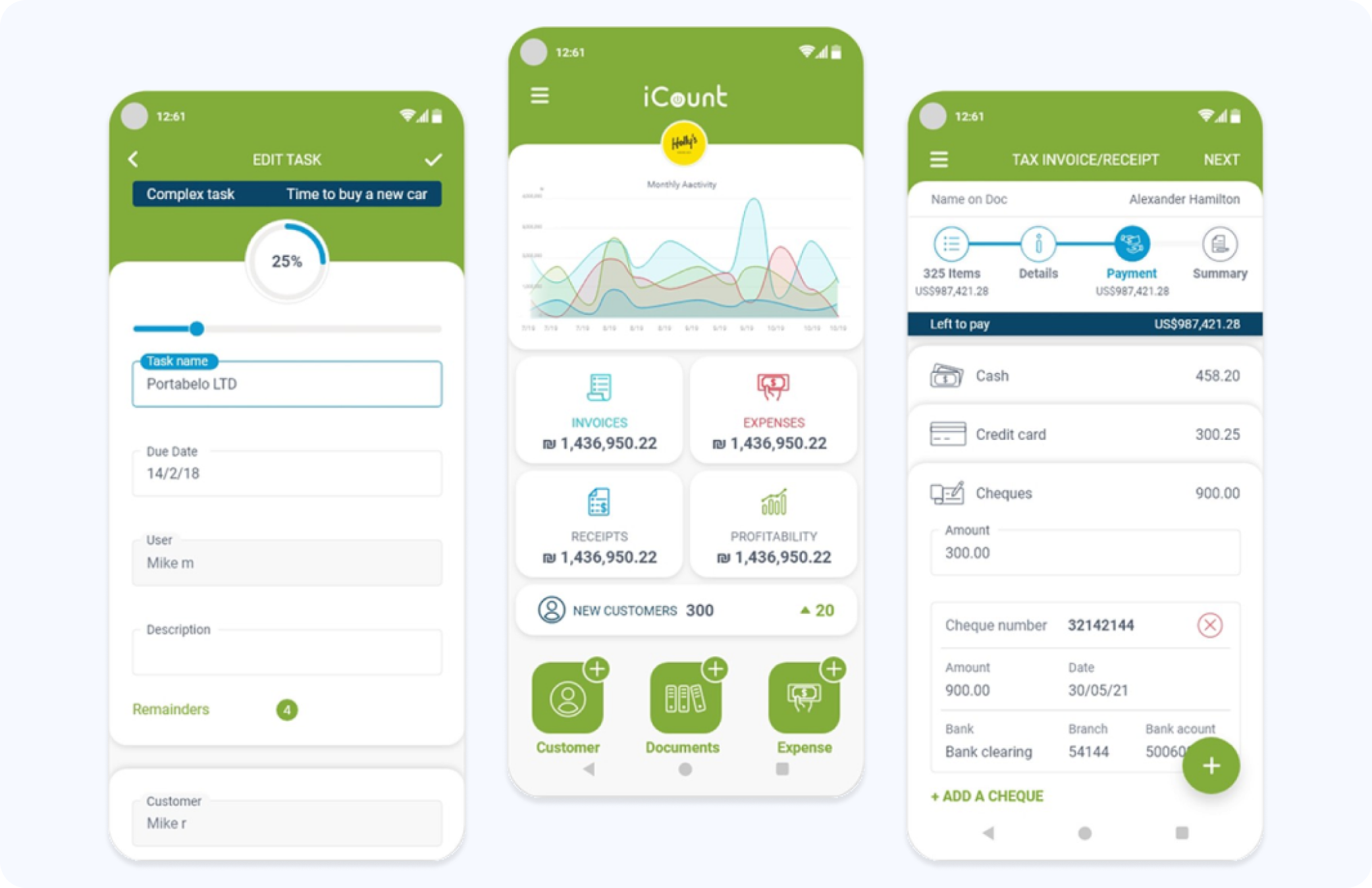
I decided to dismantle the problem: I took all the complexity and created a smart 4-step Wizard. Instead of confusing users, I guided them to focus on just one action per step.
To reassure customers, I made sure they could always see their status (progress bar) and the final total amount. The 'magic' was that all the advanced capabilities were retained, but I successfully fixed all the critical errors that had sabotaged the process.
The Result: A procedure that was once a hurdle became a seamless flow, and the failure rate dropped significantly.
Document 4 step wizard
Rebuilding Task Management from the Ground Up
Before this fix, the product simply wasn't usable: too many steps and no clear connection between sub-tasks, parent tasks, and reminders created deep confusion, and there was no way to glance at the list and understand where any task actually stood. I ran research with users who surfaced exactly these problems, then made the call to map the real hierarchy: a parent task with its own reminders, containing multiple sub-tasks — each with its own reminders and a completion percentage that rolls up into the parent task's status. Fast navigation now works in both directions, from the overview into any sub-task and back out again.
Case Study Template Page
Ready to create
great things
Got a complex challenge? Let's solve it together.


Let's talk
Download Resume