Nir G


UX/UI Redesign & Refresh
UX Enhancement & System Alignment
Webflow
Complex system
Summary
Background
The project began with a simple request to add a filter to an existing page. A closer look revealed a broader problem: the page and the entire core part of the system suffered from an outdated design, incompatibility with the latest Design System, and severe UX issues that created cognitive load.
Main challenge
Refreshing an outdated system core: Addressing outdated design, inconsistencies (Design System), and UX issues that created cognitive load, and required leading a broad system change.
CLIENT
Nice
SERVICES
- UX Strategy
- Design system
- Information Architecture
- Research & Discovery
Impact
Driving change at the core: The enthusiastic responses from shareholders and stakeholders led to a strategic decision to extend the change to the entire core part of the system (which is a critical part of the NICE platform), and not just to the original page.
Drastic Reduction in Cognitive Load
Simplified the interface and interactions across the entire evaluation system.
Company-Wide Rollout
Stakeholder enthusiasm led to a decision to expand the change across all core parts of the platform.
Company-Wide Rollout
Getting Started
Research & Definition
- Gaps and Challenges Identification: Mapping the existing usage processes revealed systemic issues: outdated design, inconsistencies according to Design System, and critical UX issues that created significant cognitive load.
- Formulating a user-driven strategy: I interviewed system administrators first to understand how the product actually worked, then product managers and Customer Success to map today's workflows and the pain points they hear from customers, then senior leadership to understand how this part of the system affects the platform as a whole — about 8 people per role. These conversations surfaced four distinct personas and led to a new information architecture and simpler, role-specific processes.
New Information Architecture
🔔 Notifications — moved to global header
Create Form
Evaluation
↳ My Evaluation
↳ Evaluator Review
↳ Audits
↳ Appeals
↳ Calibration
↳ Self Evaluation
Group Coaching

AGENT
The Agent
Performs the calls agents actually handle with customers.
MANAGER
The Agent Manager
Evaluates agents by sampling calls, scoring against a test, and reporting results — including learning material after a low score.
AUDITOR
The Auditor
Steps in when an evaluator and agent disagree, re-checks the call, and decides the final score.
FORM CREATOR
The Form Creator
Senior role tied to Service and Sales; builds evaluation forms to match business goals, reports, and campaigns on request.
Evaluation User Journey
FORM CREATOR
Builds the evaluation form based on business goals
→
AGENT
Handles the customer call
→
AGENT MANAGER
Samples the call, scores it, and reports the result
→
AGENT
Reviews result — or submits an Appeal if they disagree
→
AUDITOR
Re-checks the call and decides the final score
Supporting features across the journey:
CALIBRATION
aligns evaluators' scoring
SELF EVALUATION
agent self-rates
GROUP COACHING
for teams needing improvement
NOTIFICATIONS
keeps every role updated
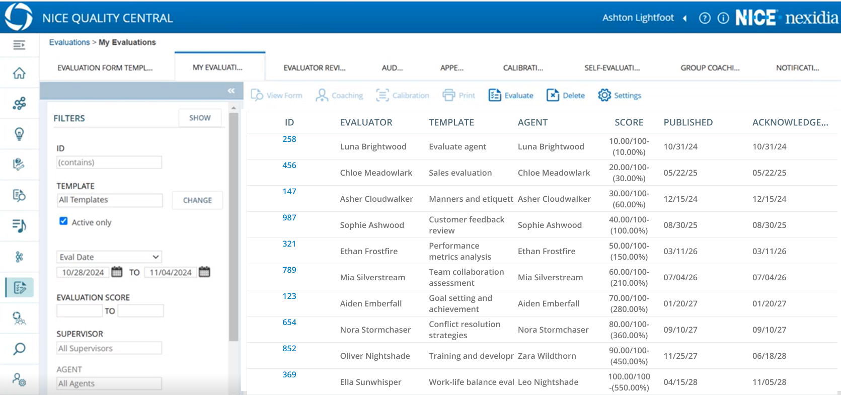
The ols system


Exempels
Reorgnize
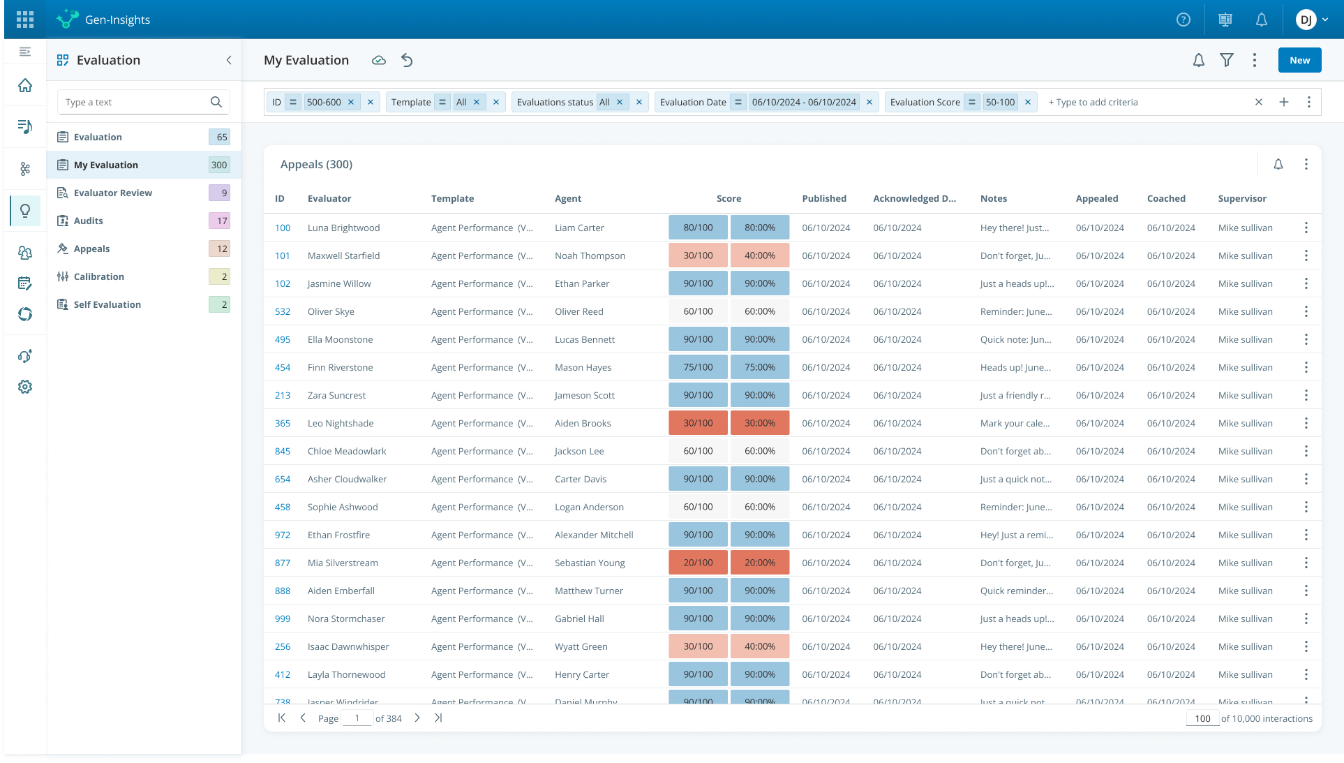
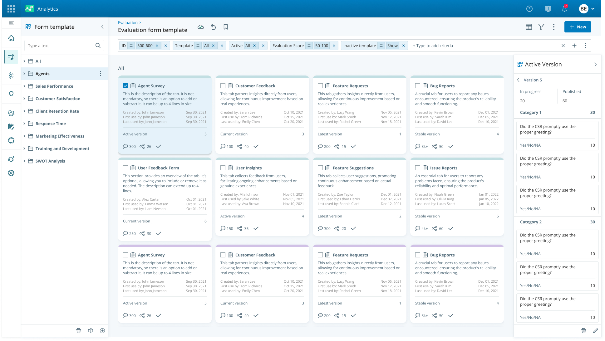
Instead of a bulky side filter panel, I implemented a top filter row that is aligned with the system design, saving valuable screen space and supporting the full range of filters.
I moved the tab menu to a designed and dynamic side panel, which is more convenient for small screens and displays several items per page. Finally, I arranged the table for full design compatibility, including highlighting key data (scores), to create pleasant reading and quick information absorption.
Document 4 step wizard
Interface Simplification & Task Focus
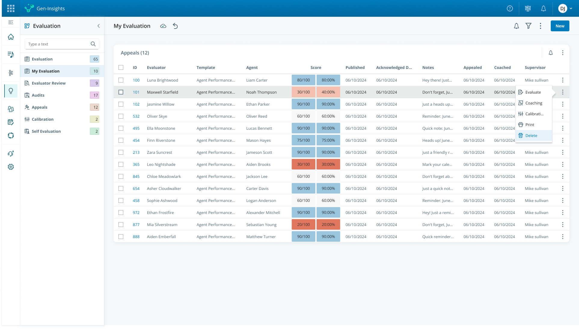
I addressed a variety of irrelevant actions that appeared at the top (some of them in the Disabled state), which created significant cognitive load. The solution was to move the row actions directly into the table, aligning with system norms, and move the page settings to the 'three dots' menu item at the top of the page. This eliminated confusion and dramatically reduced the load on the interface.
Case Study Template Page
Clarifying Multi-Select Actions
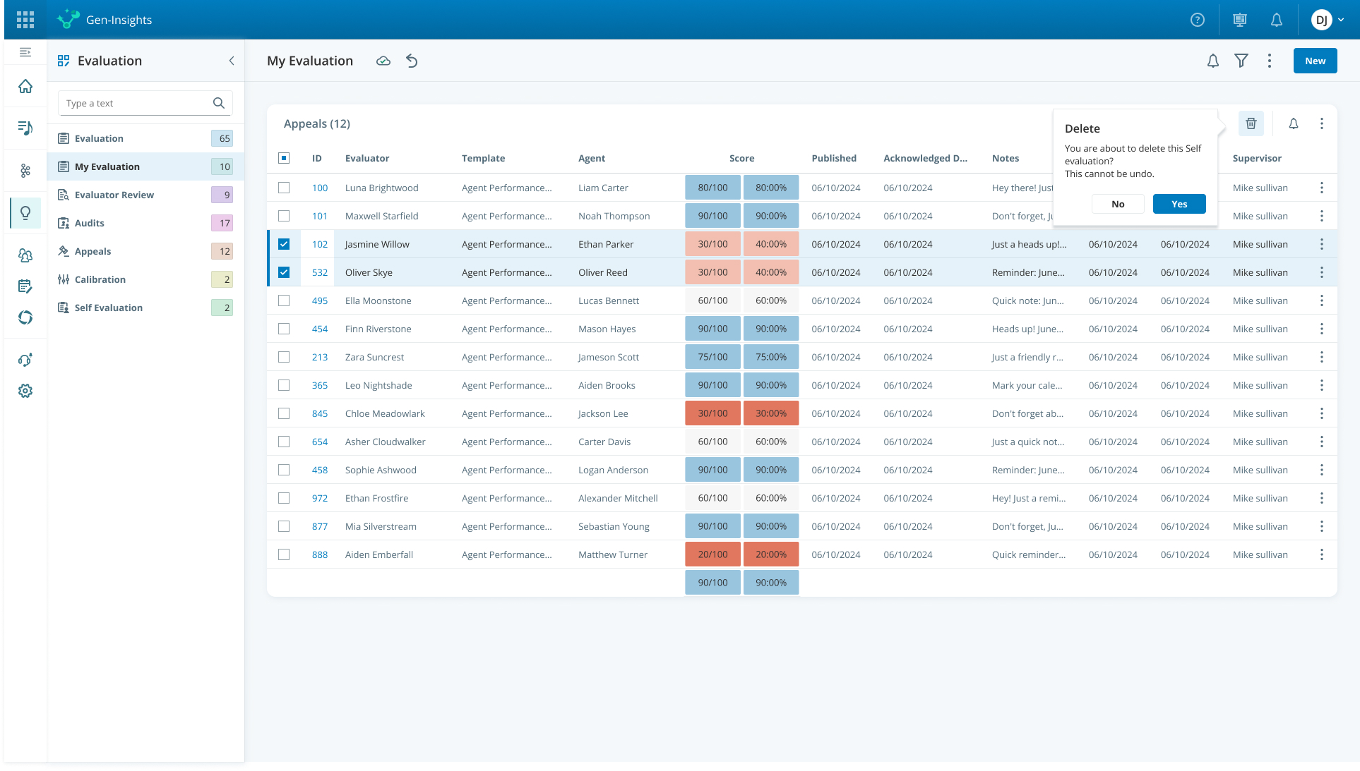
I moved the relevant multi-select actions (actions that occur after selection) to a dedicated appearance in the top panel of the screen, only after a user has selected items. This move reduced misunderstanding and frustration and significantly reduced user errors regarding the possible actions on multiple items at once.
Document 4 step wizard
Effect
What started as a request to add one filter, I turned into a case for redesigning the core — because 15 years in this space taught me to recognize when a small ask is really a symptom. That call paid off: a drastic reduction in cognitive load, improved usability, and smoother flow, with stakeholder enthusiasm driving the decision to expand the change across all core strategic parts of the system.
Ready to create
great things
Got a complex challenge? Let's solve it together.
Let's talk

Download Resume




UX/UI Redesign & Refresh
UX Enhancement & System Alignment
Webflow
Complex system
Summary
Background
The project began with a simple request to add a filter to an existing page. A closer look revealed a broader problem: the page and the entire core part of the system suffered from an outdated design, incompatibility with the latest Design System, and severe UX issues that created cognitive load.
Main challenge
Refreshing an outdated system core: Addressing outdated design, inconsistencies (Design System), and UX issues that created cognitive load, and required leading a broad system change.
CLIENT
Nice
SERVICES
- UX Strategy
- Design system
- Information Architecture
- Research & Discovery
Impact
Driving change at the core: The enthusiastic responses from shareholders and stakeholders led to a strategic decision to extend the change to the entire core part of the system (which is a critical part of the NICE platform), and not just to the original page.
Drastic Reduction in Cognitive Load
Simplified the interface and interactions across the entire evaluation system.
Company-Wide Rollout
Stakeholder enthusiasm led to a decision to expand the change across all core parts of the platform.
Company-Wide Rollout
Getting Started
Research & Definition
- Gaps and Challenges Identification: Mapping the existing usage processes revealed systemic issues: outdated design, inconsistencies according to Design System, and critical UX issues that created significant cognitive load.
- Formulating a user-driven strategy: I interviewed system administrators first to understand how the product actually worked, then product managers and Customer Success to map today's workflows and the pain points they hear from customers, then senior leadership to understand how this part of the system affects the platform as a whole — about 8 people per role. These conversations surfaced four distinct personas and led to a new information architecture and simpler, role-specific processes.
New Information Architecture
🔔 Notifications — moved to global header
Create Form
Evaluation
↳ My Evaluation
↳ Evaluator Review
↳ Audits
↳ Appeals
↳ Calibration
↳ Self Evaluation
Group Coaching
AGENT
The Agent
Performs the calls agents actually handle with customers.
MANAGER
The Agent Manager
Evaluates agents by sampling calls, scoring against a test, and reporting results — including learning material after a low score.
AUDITOR
The Auditor
Steps in when an evaluator and agent disagree, re-checks the call, and decides the final score.
FORM CREATOR
The Form Creator
Senior role tied to Service and Sales; builds evaluation forms to match business goals, reports, and campaigns on request.
Evaluation User Journey
FORM CREATOR
Builds the evaluation form based on business goals
→
AGENT
Handles the customer call
→
AGENT MANAGER
Samples the call, scores it, and reports the result
→
AGENT
Reviews result — or submits an Appeal if they disagree
→
AUDITOR
Re-checks the call and decides the final score
Supporting features across the journey:
CALIBRATION
aligns evaluators' scoring
SELF EVALUATION
agent self-rates
GROUP COACHING
for teams needing improvement
NOTIFICATIONS
keeps every role updated
The ols system
Exempels
Reorgnize
Instead of a bulky side filter panel, I implemented a top filter row that is aligned with the system design, saving valuable screen space and supporting the full range of filters.
I moved the tab menu to a designed and dynamic side panel, which is more convenient for small screens and displays several items per page. Finally, I arranged the table for full design compatibility, including highlighting key data (scores), to create pleasant reading and quick information absorption.
Document 4 step wizard
Interface Simplification & Task Focus
I addressed a variety of irrelevant actions that appeared at the top (some of them in the Disabled state), which created significant cognitive load. The solution was to move the row actions directly into the table, aligning with system norms, and move the page settings to the 'three dots' menu item at the top of the page. This eliminated confusion and dramatically reduced the load on the interface.
Case Study Template Page
Clarifying Multi-Select Actions
I moved the relevant multi-select actions (actions that occur after selection) to a dedicated appearance in the top panel of the screen, only after a user has selected items. This move reduced misunderstanding and frustration and significantly reduced user errors regarding the possible actions on multiple items at once.
Document 4 step wizard
Effect
What started as a request to add one filter, I turned into a case for redesigning the core — because 15 years in this space taught me to recognize when a small ask is really a symptom. That call paid off: a drastic reduction in cognitive load, improved usability, and smoother flow, with stakeholder enthusiasm driving the decision to expand the change across all core strategic parts of the system.
Ready to create
great things
Got a complex challenge? Let's solve it together.
Let's talk
Download Resume


UX/UI Redesign & Refresh
UX Enhancement & System Alignment
Webflow
Complex system
Design system
Summary
Background
The project began with a simple request to add a filter to an existing page. A closer look revealed a broader problem: the page and the entire core part of the system suffered from an outdated design, incompatibility with the latest Design System, and severe UX issues that created cognitive load.
Main challenge
Refreshing an outdated system core: Addressing outdated design, inconsistencies (Design System), and UX issues that created cognitive load, and required leading a broad system change.
CLIENT
Nice
SERVICES
- UX Strategy
- Design system
- Information Architecture
- Research & Discovery
Impact
Driving change at the core: The enthusiastic responses from shareholders and stakeholders led to a strategic decision to extend the change to the entire core part of the system (which is a critical part of the NICE platform), and not just to the original page.
Drastic Reduction in Cognitive Load
Simplified the interface and interactions across the entire evaluation system.
Company-Wide Rollout
Stakeholder enthusiasm led to a decision to expand the change across all core parts of the platform.
Company-Wide Rollout
Getting Started
Research & Definition
- Gaps and Challenges Identification: Mapping the existing usage processes revealed systemic issues: outdated design, inconsistencies according to Design System, and critical UX issues that created significant cognitive load.
- Formulating a user-driven strategy: I interviewed system administrators first to understand how the product actually worked, then product managers and Customer Success to map today's workflows and the pain points they hear from customers, then senior leadership to understand how this part of the system affects the platform as a whole — about 8 people per role. These conversations surfaced four distinct personas and led to a new information architecture and simpler, role-specific processes.
New Information Architecture
🔔 Notifications — moved to global header
Create Form
Group Coaching
Evaluation
My Evaluation
Evaluator Review
Audits
Appeals
Calibration
Self Evaluation
AGENT
The Agent
Performs the calls agents actually handle with customers.
MANAGER
The Agent Manager
Evaluates agents by sampling calls, scoring against a test, and reporting results — including learning material after a low score.
AUDITOR
The Auditor
Steps in when an evaluator and agent disagree, re-checks the call, and decides the final score.
FORM CREATOR
The Form Creator
Senior role tied to Service and Sales; builds evaluation forms to match business goals, reports, and campaigns on request.
Evaluation User Journey
FORM CREATOR
Builds the evaluation form based on business goals
→
AGENT
Handles the customer call
→
AGENT MANAGER
Samples the call, scores it, and reports the result
→
AGENT
Reviews result — or submits an Appeal if they disagree
→
AUDITOR
Re-checks the call and decides the final score
Supporting features across the journey:
CALIBRATION
aligns evaluators' scoring
SELF EVALUATION
agent self-rates
GROUP COACHING
for teams needing improvement
NOTIFICATIONS
keeps every role updated
The ols system
How I Approached the Problem
Reclaiming Space, Reducing Clutter
Instead of a bulky side filter panel, I implemented a top filter row that is aligned with the system design, saving valuable screen space and supporting the full range of filters.
I moved the tab menu to a designed and dynamic side panel, which is more convenient for small screens and displays several items per page. Finally, I arranged the table for full design compatibility, including highlighting key data (scores), to create pleasant reading and quick information absorption.
Document 4 step wizard
Interface Simplification & Task Focus
I addressed a variety of irrelevant actions that appeared at the top (some of them in the Disabled state), which created significant cognitive load. The solution was to move the row actions directly into the table, aligning with system norms, and move the page settings to the 'three dots' menu item at the top of the page. This eliminated confusion and dramatically reduced the load on the interface.
Case Study Template Page
Clarifying Multi-Select Actions
I moved the relevant multi-select actions (actions that occur after selection) to a dedicated appearance in the top panel of the screen, only after a user has selected items. This move reduced misunderstanding and frustration and significantly reduced user errors regarding the possible actions on multiple items at once.
Document 4 step wizard
Effect
What started as a request to add one filter, I turned into a case for redesigning the core — because 15 years in this space taught me to recognize when a small ask is really a symptom. That call paid off: a drastic reduction in cognitive load, improved usability, and smoother flow, with stakeholder enthusiasm driving the decision to expand the change across all core strategic parts of the system.
Ready to create
great things
Got a complex challenge? Let's solve it together.
Let's talk
Download Resume